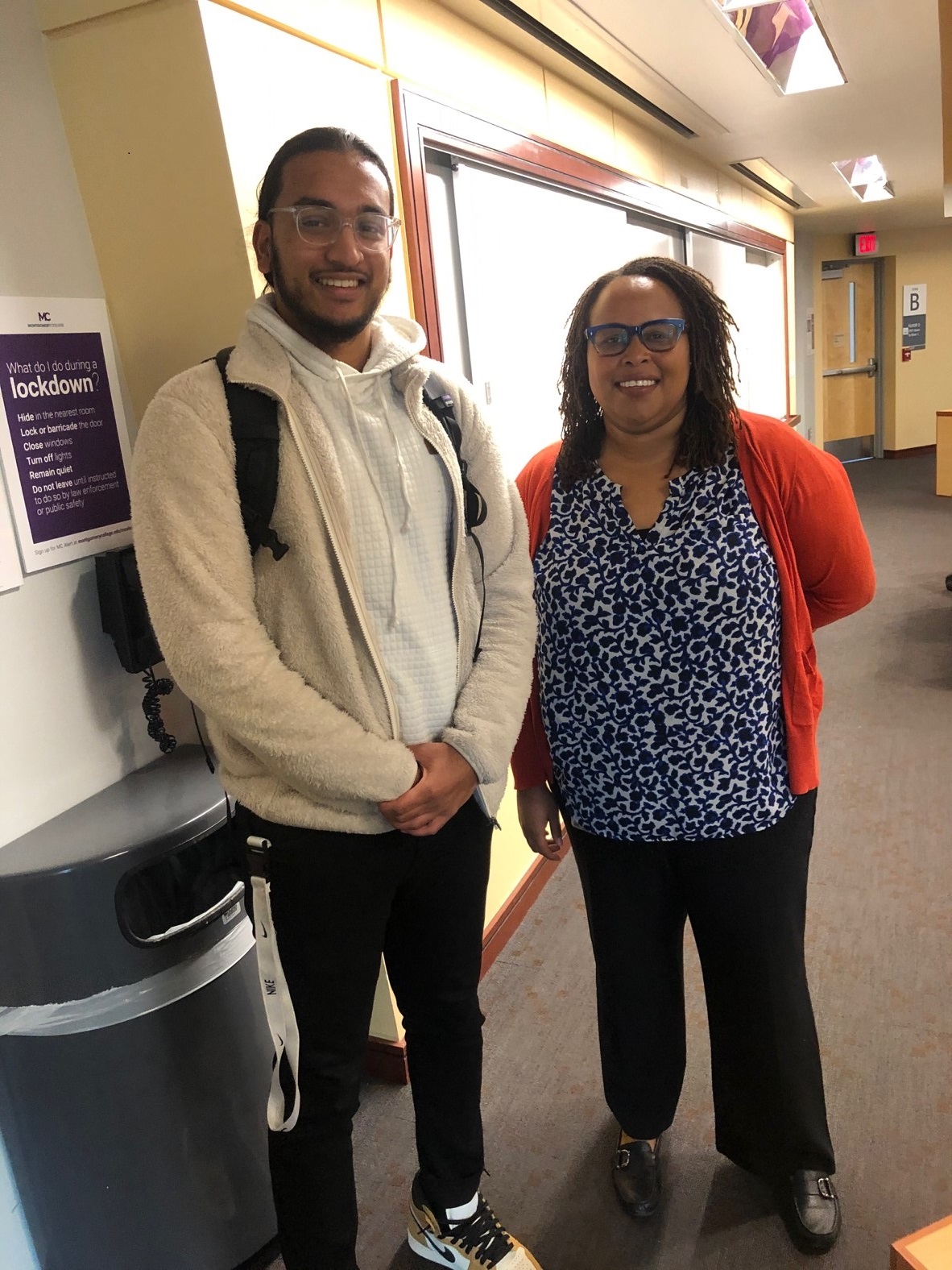
Insights by Shayna Berman On Tuesday, November 19, I attended a Montgomery College (MC) to…
 By Samir Kabir
_________
I have always been interested in design – specifically, app/web design. A Hillman classmate informed me of an event at the University of Maryland through a Facebook event. The event, which took place on November 15, was titled: “Startup Shell + Terrapin Hackers: Designing Digital Experiences.” The short, but impactful event focused on creating an ideal user experience for app users and crafting design for users that will make them want to stay on your platform. The workshop was given by Sam Drozdov, a senior undergraduate at the University of Maryland studying Product Design & Software Innovation (sounds like a major I might be interested in!). Mr. Drozdov previously worked on a key transportation application for the city transit system of NYC, and developed an impressive portfolio of apps that are widely used. During the presentation, Mr. Drozdov focused on three key design elements: easy navigation, creating simple interfaces, and measuring the success of user experiences.
During the presentation, Mr. Drozdov punctuated his presentation with live, animated examples that complemented his speaking points. He prompted us to check out these live examples as the presentation went along, as we had to observe the examples from the perspective of the user. He started his presentation off by describing the definition of users, and tailoring ones’ product to their key demographic (i.e. business owners/laymen). After this preface, he jumped into the first key design element: navigation. Within navigation, there are three primary structures that are implemented: hierarchy (i.e. iOS settings), Flat (YouTube/Medium), and Experience Driven (determined by purpose of app, i.e. specific elements within the Google Maps app). These three layouts are complemented by practices within navigation that end users often do not pay much attention to, but is essential for smooth operation. These include escape routes (going back to main page, i.e. FB logo), Continuation (keeps user focused on present/future actions), Progressive Disclosure (menu type items; allows user to show/hide details, allows user to expand choice through simplicity), and Breadcrumbs (Levels i.e. Books > Art & Photography > Fiction). When it comes to intuitive interfaces, there are two rules that are the overarching questions to keep in mind to keeping an interface clean, which are: 1) “Where am I”, and 2) “Where am I going?”. In this respect, buttons do NOT dictate where a user goes (discoverability does not equate to understandability!). There is a fine balance between having too many, or too little elements in one place, as either implementation can have a counterintuitive effect. Along the intuitive route, interfaces incorporate a minimalist view of design systems. Design systems include text, colors, and systems. Finally, when it comes to measuring success, two methods are used to bring on new users: feedback, and analytics. Feedback methods are split between modern, and traditional testing. Modern testing amounts to in app user feedback, and making it easy for one to find the feedback dialogue, while traditional methods include focus groups, where users say out loud why they are doing a certain action, and A/B testing, where users are presented two options, and they must choose between one of them. Oftentimes, it is also important to “think a step higher than feedback”. What does this mean? Mr. Drozdov defined it as thinking of what works for all your users, instead of implementing a specific detail that is requested by a small group of users. A practical example he gave relates to his time developing the transit system app. During a crucial development phase, Mr. Drozdov and his team were receiving input on reversing the transit schedule. Essentially, users were asking to reverse the transit schedule on their app based on their location, but this would present a problem whenever users would use their cars to pick up someone else. To fix this issue, Mr. Drozdov implemented a reversal of the schedule based on time, instead of location. Analytics focuses more on user retention, or the number of users left after a specified time period. Two key analytics developers must focus on are conversion. Conversion is measuring the point where a user fails to input a certain action, and finding a “magic moment”, a moment where users will more likely than not continue using an app (i.e. Facebooks magic moment is when a user has 10+ added friends). In developing a functional and sustainable app or website, feedback and analytics go hand in hand – without the other, an app will tend to be buggy and unintuitive for the user.
The presentation by Mr. Drozdov was dynamic and cohesive. Key points were presented, and they were complemented by the clear, animated examples from the presentation. The presentation was marketed to a group of “users” who had no previous design experience, and this purpose was achieved. In stumbling upon the Startup Shell facility, I discovered a ton of useful resources that I had not known about previously. The Startup Shell, among many other free monthly/weekly events, hosts an entrepreneur ship mentoring program, known as “Dingman Fridays”, were actionable advice is presented to entrepreneurs, by seasoned entrepreneurs. These resources are free; for Startup Shell, all that is required is an application. I am thankful for discovering this facility, as I will take advantage of this invaluable resource upon my transfer to the University of Maryland.
Note: To learn more about Startup Shell, click here.


This Post Has 0 Comments